-
Home
- User Interface - Reference
User Interface - Reference
The user interface consists of the components listed below. Click on the corresponding link to see detailed information.
 Easy navigation in the user interface
Navigation in iCube Engineer is possible with the keyboard anywhere in the user interface:
- Press and hold the keyboard shortcut <Ctrl> + <Tab>.
A navigation control appears showing the controls on the left side and the currently open editors on the right:
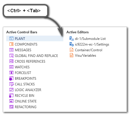
- While holding <Ctrl> + <Tab> down, use the arrow keys on your keyboard to navigate to the desired control or editor and release the shortcut to set the cursor into it.
Switching between editors of an editor group
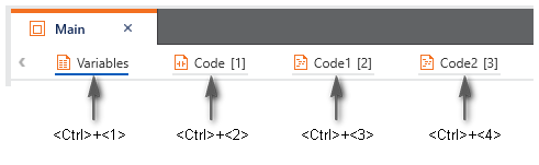
You can switch between the editors of an editor group (represented as tabs at the upper border of the editors area) via
- Keyboard
Press the <Ctrl> key combined with the consecutive number of the editor tab, starting with 1.
Example: In the following editor group, the shortcut <Ctrl>+<3> opens the worksheet 'Code1'. Press <Ctrl>+<0> to open the 10th editor.
Note that the number in brackets [...] is the number in the execution order of the code worksheets but not the worksheet number.
- Drop-down icon at the top right corner
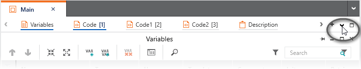
Clicking the drop-down icon at the top right corner in the editors bar opens the list with all editors of the current editor group. Select the desired editor from the list to open and bring the editor into focus.
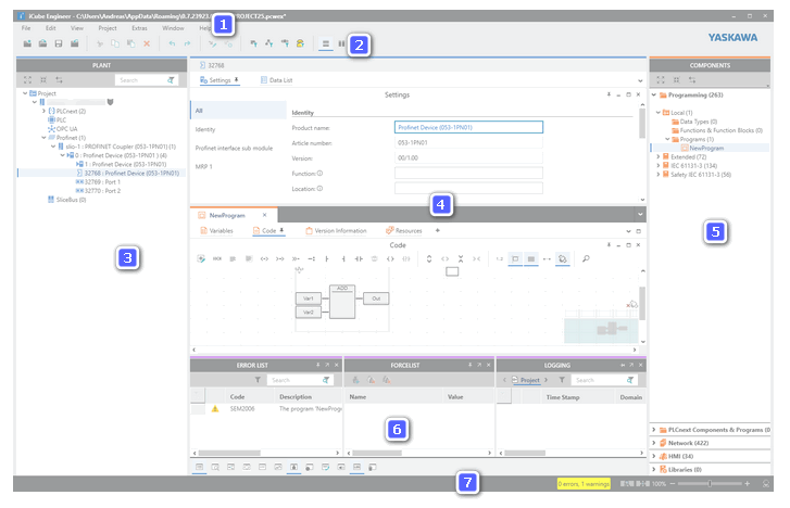
| (1) | : provides access to a set of project-related commands which do not explicitly relate to a particular engineering task (such as PLANT structuring, IEC 61131-3 programming etc.). |
| (2) | : provides access to a set of project-relating commands which do not explicitly relate to a particular engineering task (such as PLANT structuring, IEC 61131-3 programming etc.).Additionally, the various areas and editors provide their own specific toolbars. Refer to the respective online help topic for more information. |
| (3) | PLANT area: tree reflecting the physical and logical components of the machine/plant to be controlled.
- Each logical and physical component is represented by a tree node.
- By inserting a component type from the COMPONENTS area into the PLANT, it is instantiated in the project.
- Double-clicking a PLANT tree node (instance of a type) opens its properties in the respective editors.
For the program and FB instances shown in the PLANT the following applies: In debug mode, double-clicking a program or FB instance icon opens the instance-related code and displays variable values read from the controller. In programming mode, the Data List appears.
- Safety-related instances in the PLANT are indicated by the
 overlay icon. Observe the note following this list regarding edit operations on safety-related data. overlay icon. Observe the note following this list regarding edit operations on safety-related data.
- If an OPC UA server is provided in the application and/or OPC UA PubSub communication is supported by the controller (as of firmware version 22.0), the related editors are available on the 'OPC UA' icon in the PLANT.
The toolbar (2) provides buttons to show/hide objects that belong to a particular engineering discipline (such as programming objects, or network objects, etc.). |
| (4) | Editors area: shows the various editors of objects in the PLANT and COMPONENTS.
- PLANT node: double-clicking a node in the PLANT opens an editor group in the editors area which may contain several editors. Which editors are available depends on the node type and its properties. Refer to the topic "PLANT Tree Node Editors" for details on the available editors.
- COMPONENTS node: double-clicking a data type worksheet, a program, function or function block node in the respective category in the COMPONENTS area on the right, opens the type in the respective editors for defining data types and developing POUs. Refer to the topic "COMPONENT Types Editors" for details on the available editors.
|
| (5) | COMPONENTS area: provides elements divided in different categories and folders. Each element contained in the COMPONENTS area can be considered as "type". By using a component type in the project, it is instantiated in the project.These elements are used for: The toolbar (2) provides buttons to show/hide objects that belong to a particular engineering discipline (such as programming objects, or network objects, etc.). Using these buttons, the number of visible objects in the COMPONENTS area can be reduced to improve clearness. |
| (6) | Cross Function Area: in this area, various controls for engineering task-spanning, project-wide functions are provided.
|
| (7) | Status bar: indicates detected errors and warnings and provides zoom options for graphic worksheets active in the editors area.On the left side, the logon status to the Safety-related Area is indicated. While being logged off, clicking the entry opens the authentication mask for logging on. While being logged on, clicking the entry logs off. Opened safety-related editors switch to read-only mode when logging off. |
Note
Editing safety-related data (e.g., adding devices or POUs, editing properties or code) is only possible while you are logged on to the Safety-related Area. Safety-related data can be displayed in read-only mode, while you are logged off.
While being logged off, the authentication mask for entering the password appears automatically if you start to edit safety-related data. |